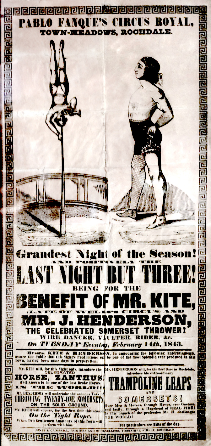
Being to the Detriment of Mr. Kite
While looking for the lyrics (important research!) of The Beatles’ Being for the Benefit of Mr. Kite! I ran across a website explaining the origin of the song. It seems that John Lennon bought an old circus poster, on impulse, after finding it in an antique shop, and rearranged many of the words into a song.
Here is a picture of John Lennon, with the poster, that appeared on that website. (Many of these images may be subject to copyright; I post them here under the Fair Use provision of U.S. copyright law. Please don’t be That Corporation and ask me to take them down.)
Well, that’s quite the factoid. I’ve been listening to songs from Sgt. Pepper’s Lonely Hearts Club Band for at least 30 years, and I never knew that before today. Now intrigued, I wanted to know what a somerset thrower was, and ran across a couple of other interesting articles, including one titled Pablo Fanque’s Fair from September 2011 in the Smithsonian Magazine website.
Here is a photo of the poster from the Smithsonian website:
Right away I knew something was wrong. This was not the same poster.
I should perhaps mention that I have super typography powers. Comic Sans is my kryptonite.
The phrase BENEFIT OF MR. KITE, in the Smithsonian article poster, is a modern typeface. It jumps out at me, screaming 21st CENTURY!!!! — or at the very earliest, perhaps the 1960s — and I am immediately skeptical, with just a quick glance. Upon closer inspection — yes, look at the letter M. The poster that Lennon points toward has an M with straight outer legs. The Smithsonian facsimile has angled legs.
Don’t see it?
Here’s a close-up of the two phrases; the top one with Lennon’s finger is the real poster, the bottom one is the facsimile:

You can see differences in the R as well; the facsimile has a straight slanted R leg, whereas the real R has a rounded leg that becomes near-vertical. There are other minor differences — the clean white background of the facsimile, the gaps in the border arabesques — but the MR is the giveaway.
If you want to see the facsimile in more detail, the Internet Archive has a copy.
I have contacted the Smithsonian Magazine website; let’s see what they say…
Meanwhile I wanted to find an image of the real poster.
Next up: ringlingdocents.org had the Lennon / poster photo, along with a closeup of “the original poster”. Right.
Someone went to the trouble of faking ragged, yellowed edges.... and then they used some variant of Arial Narrow for BENEFIT OF MR. KITE, which is like the graphic arts equivalent of leaving a toy cap gun at the scene of a crime after paying someone to fake the right blood spatter to suggest a suicide. Why bother? If it’s that fake, don’t even try.
BENEFIT OF MR. KITE,
That’s not a perfect match, but it’s pretty close. The one in the facsimile poster looks like a version used to make cheap street signs, somewhere in weight between Arial Narrow Regular and Arial Narrow Bold.
Arial itself is a kind of cheap version of Helvetica; you can see the difference in the leg of the R:
Sigh.
We move on to WorthPoint, which is a kind of eBay aggregator:
Again, different typefaces; the MR is from some modern typeface, with slanted M and R legs.
To its credit, this listing does say that it is a “Nice reproduction of the victorian poster that inspired Lennon’s ‘Being for the Benefit of Mr. Kite’ “.
The Liverpool Beatles Museum posted a tweet in February 2021:
There are two linked photos, one of Lennon and the poster, and the other of the poster.... or is it?
If you look carefully in the lower right corner, there’s some fine print:

It says www.(something).com; URLs were definitely not present in the 1840s, so this is a reproduction, but at least it looks like a good one. I wish they’d mentioned it was a reproduction.
Wikipedia does (at present) list an image that appears to be a photograph of the original, with the small tear at the lower left, but it doesn’t show the provenance of the image: where and when was it photographed?
Then of course there’s kiteprint.com…
And a Shawn McBee tried to improve on this:

Well, what’s the point of all this nitpicking? I suppose it doesn’t matter too much, but when a reputable source like Smithsonian Magazine posts incorrect information, it tends to get picked up and copied in many other places, until the facsimiles outnumber the originals.
Case in point: beatlesbible.com appears to show the same reproduction as in the Smithsonian webpage.
I give up. This makes me think of another famous Lennon lyric:
Let me take you down
‘Cause I’m going to Strawberry Fields
Nothing is real
And nothing to get hung about
Strawberry Fields forever


